As the colder weather fades, consumer spending habits naturally begin to shift. Businesses must adapt their storefronts quickly, and the absolute fastest way to capture this renewed buyer energy is by deploying a highly optimized spring sales website banner. This single piece of screen real estate serves as the frontline of your marketing campaign.
Before launching into the busy season, it is critical to study SEO best practices, structure your content, and research high value long tail and short tail keywords related to seasonal retail transitions.
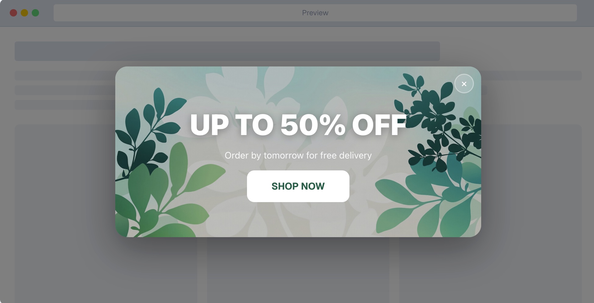
What is a Spring Sales Website Banner
A spring sales website banner is a horizontal graphic or notification bar deployed at the top, bottom, or hero section of a webpage designed specifically to announce seasonal spring promotions. It acts as a primary merchandising tool to immediately alert visitors about limited time deals, new spring product collections, or discount codes without forcing them to hunt for the information. These banners are highly structured for extraction and immediate impact, heavily relying on contrasting colors, urgent copy, and robust widget integrations.
The Psychology Behind Seasonal Marketing
When the season changes, so does consumer psychology. Spring represents renewal, cleaning, and fresh starts. By tapping into these psychological triggers, a spring sales website banner can drastically improve your overall conversion rate.
People are naturally inclined to engage with content that feels timely and relevant to their current environment. When visitors see a banner referencing spring, they subconsciously recognize that the business is active, updated, and presently engaged with its audience. This builds fundamental trust. Furthermore, seasonal sales inherently carry a deadline. Utilizing the concept of scarcity and urgency forces a decision. When users know a deal is tied strictly to the spring season, they understand it will not last forever.
Research in behavioral economics tells us that limiting availability creates a fear of missing out. You can leverage this heavily. By pairing the visual cues of spring with time sensitive copy, your banner transforms from a passive image into an active conversion mechanism.
Essential Design Elements for High Conversions
Creating an effective spring sales website banner requires more than just picking pastel colors. You must approach it with a strict conversion rate optimization mindset.
First, consider your visual hierarchy. The human eye naturally scans websites in a Z pattern. You should place your most important elements along this path. The headline needs to be the largest text, followed by a smaller subheadline, ending precisely on a high contrast button.
Second, embrace whitespace. Cluttered collages distract the user. A single hero product or a cohesive collection floating in clean space performs significantly better than a busy lifestyle image packed with text. The visual should support the offer, not compete with it.
Third, color psychology is critical. While spring pastels are traditional, your button must stand out. If your banner background is a soft mint green, your button should be a vibrant contrasting color like deep orange or bold navy blue.
Lastly, always build for a mobile first experience. A banner that looks stunning on a massive desktop monitor but becomes illegible on a smartphone is a massive failure. Ensure your text is large enough to read without zooming and that the button is easily tappable for mobile users.
Value Addition: Powering Your Offer with EaseNotify Features
To build the highest converting banners possible, you require robust toolsets. With EaseNotify, integrating interactive, high utility alerts requires zero technical overhead. When structuring your spring sales website banner, you must tap into these core utilities:
1. Banners & Announcement Bars: Rather than generic static images, rely on smart announcement bars that adapt fluidly to the top or bottom of the screen.
2. Countdown Timers: Scarcity drives action. Injecting a highly visible countdown timer directly within your banner proves to customers that your spring offer will evaporate shortly, driving immediate conversions.
3. Advanced Widget Control Settings: EaseNotify delivers granular personalization. You can utilize the Scheduling Widget to control exactly when your spring promotion goes live and shuts down automatically.
4. Page Targeting: Do not spam your audience. Use specialized page targeting to show your spring sales website banner exclusively on high intent pages (like checkout or specific product collections).
5. Dismissal Autonomy: Enhance the user experience by using an Auto-close Widget that dismisses the banner after a set duration. Further configure a heavily contrasted Close Button (adjusting icon and background color) so users feel fully in control.
6. Smart Retention: The Sticky Widget guarantees the banner stays visible securely while they scroll. Meanwhile, the crucial Remember Dismissal functionality ensures that if a visitor closes the widget, it will not persistently annoy them by reappearing during their session.
How to Write Persuasive Banner Copy
The copy on your spring sales website banner must be incredibly concise. You have approximately three seconds to hook the visitor.
Lead with a strong, benefit driven headline. Instead of a generic “Spring Sale”, use specific language like “Refresh Your Home with 25 Percent Off”. This instantly tells the customer what they get and why it matters.
Avoid using industry jargon. Speak directly to the customer using simple, active verbs. Words like “Discover”, “Refresh”, “Upgrade”, and “Save” inspire action.
If you use a subheadline, it should provide the necessary context that the headline could not fit. For example, if the headline is the discount, the subheadline can clarify the terms, such as “Valid on all new arrivals until Sunday”.
Remember that clarity will always outperform cleverness. If a user is confused by a pun or a complex joke, they will not click.
Optimizing the Call to Action Button
Your Call to Action button is the most critical element of the entire banner. If visitors cannot find it, or feel uninspired to interact with it, the entire campaign fails.
Do not use phrases like “Click Here” or “Submit”. These are low friction but extremely low value words. Instead, communicate exactly what happens next. Use phrases like “Shop the Spring Sale”, “Claim Your Discount”, or “Get Started Now”.
The button needs a prominent placement and significant contrasting color. Give the button room to breathe. Do not crowd it with asterisks or small text, as this creates visual anxiety.
Placement Strategies Across Different Pages
Many businesses mistakenly only place their spring sales website banner on the homepage. While the homepage is important, it is not the only high traffic area on your website.
Consider utilizing the Sticky Widget feature from EaseNotify that follows the user as they scroll or navigate to different pages. This ensures the promotion remains top of mind regardless of where they enter your site.
Additionally, placing targeted banners on specific category pages allows you to highly contextualize the offer. If someone is browsing the outdoor furniture category, a banner specifically highlighting the outdoor sale will convert at a higher rate than a generic storewide banner.
You can reference external guides on site architecture and funnel optimization from authoritative sources like the Shopify eCommerce to understand user flow.
Technical Implementation on Major Platforms
Implementing your banner correctly ensures fast site speeds and proper tracking.
For Shopify users, the fastest method without sacrificing page load speed is using an external widget integration like EaseNotify. Modern stores require advanced scheduling, A B testing, and geo targeting. Implementing specialized notification tools ensures you do not bog down your core liquid files with heavy, unoptimized custom code.
For BigCommerce users, navigating the native control panel allows for rapid deployment, but often lacks the nuance of an Auto-close Widget or properly remembered dismissal states.
If you manage a custom tech stack, ensure your development team uses semantic HTML and CSS rather than embedding text inside an image file. Text embedded in images damages accessibility and prevents Answer Engine bots from properly extracting and crawling your promotional details.
A/B Testing Your Banner Performance
You must never rely on guesswork. Implementing a rigorous testing strategy is the only way to maximize revenue.
Start by testing one variable at a time. The most impactful elements to test are your headline, the offer itself (for example, percentage off versus a fixed dollar amount), and the button color.
Run your tests until you reach statistical significance. A common mistake is ending a test after only two days because one variation looks slightly better. Allow the data to mature. Analyze the click through rate and, more importantly, the final conversion rate. A banner might get many clicks, but if those users immediately bounce, the message and the landing page are disconnected.
Integration with Other Marketing Channels
A spring sales website banner cannot exist in a vacuum. It must be part of an omnichannel strategy.
Ensure the visual language, color palette, and specific copy match the campaigns you are running on social media and email marketing. If a customer clicks an email highlighting a green floral spring sale, they expect to land on a website displaying the exact same green floral aesthetic. A massive disconnect causes immediate distrust and high bounce rates.
Coordinate your launch timing utilizing the Scheduling Widget. Your banner should go live the exact moment your marketing emails hit inboxes. Consistency reinforces the message and compounds the psychological urgency.
Common Mistakes to Avoid in Banner Design
There are several pitfalls that completely ruin banner performance.
The first is overcrowding the design. Adding too many products, multiple fonts, and giant blocks of text overwhelms the user.
The second mistake is ignoring mobile optimization, as discussed earlier. A banner without a fully adaptable mobile view will destroy layout flow.
The third mistake is ignoring visitor autonomy. Without implementing a Remember Dismissal feature, users will constantly be bombarded by the same banner whenever they refresh the page. Friction will inevitably cause them to exit completely.
Finally, failing to set an end date or clear terms leads to customer service nightmares. Always be transparent about when the seasonal promotion ends, ideally using a dynamic countdown timer that physically ticks down the final hours.
Frequently Asked Questions (FAQs)
Q: How long should I run a spring sales website banner?
A: A typical seasonal banner should run between two to four weeks. Running it longer causes banner blindness, where returning visitors unconsciously ignore the promotion because it no longer feels urgent or new.
Q: Should my banner be an image or dynamic code?
A: Always use dynamic tools and coded text. This ensures your website retains accessibility for screen readers, scales safely on mobile devices, allows specific page targeting, and enables Answer Engine optimization.
Q: Where is the best place to put an announcement banner?
A: The highly effective placement is a sticky bar at the very top of the website. It remains visible without interrupting the immediate browsing experience and ensures maximum viewability when targeting specific collection pages.
Q: How much text should be on a website banner?
A: Keep text under ten words. Focus on a highly impactful headline, a quick context string, and a prominent call to action. Clutter drastically reduces the likelihood that a visitor pauses to digest the promotion.
Q: What colors convert best for spring promotions?
A: Pastels build strong seasonal aesthetics, however your action button requires intense contrasting colors. Deep orange, bright pink, or bold navy against a soft spring background definitively increase click through interactions.
2 thoughts on “Spring Sales Website Banner: 11 Best High Converting Tactics”