As an ecommerce owner or digital marketer, you need a highly visible, frictionless method to publish sitewide updates. You must guarantee your visitors see critical information immediately without interrupting their core browsing experience. The most effective way to accomplish this is by deploying a free website announcement bar at the top or bottom of your page.
Before you invest in heavy development resources, you must study SEO and understand that deploying these sticky banners is wildly effective for conversion rate optimization. Thorough internet research proves that announcement bars drive traffic to specific pages faster than almost any other site element when utilized correctly with strong short tail and long tail keywords.
What is a Free Website Announcement Bar
A free website announcement bar is a narrow, horizontal notification banner usually deployed at the extreme top or bottom of a webpage to share critical, time sensitive information with visitors. Frequently utilized for promotional sales, shipping updates, service notices, or policy changes, this tool stays visible as a user scrolls. Instead of demanding immediate interaction like an aggressive popup, an announcement bar respects the user experience while successfully capturing their attention with high contrast colors and simple calls to action.
Why Every Modern Website Needs Notification Banners
Sticky announcement bars immediately highlight discount codes, sale announcements, shipping thresholds, and core service updates without forcing the customer to search through menus or contact support.
In modern web design, keeping a visitor on the page is paramount. If a user has a question regarding shipping constraints and cannot find the answer within ten seconds, they will bounce. An announcement bar instantly dispels anxiety by placing the most common objections directly into the visitors line of sight.
This specific format works particularly well on mobile devices, where screen real estate is exceptionally limited. Using a high quality tool to host your banner ensures that crucial metrics are met without bloating the site code.
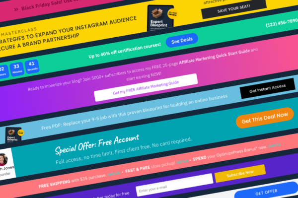
High Converting Announcement Bar Examples
To maximize the impact of your free website announcement bar, you must understand exactly how to deploy it based on your core marketing goals. Here are the three primary examples of banner campaigns that consistently output incredible return on investment.
Sales and Promotional Campaigns
Promotional announcement bars remain the absolute most common type utilized across ecommerce platforms. They operate primarily to highlight ongoing sales, sitewide massive discounts, new product arrivals, or limited time seasonal offers. The core objective is guiding the visitor from any generic landing page directly to a specific collection. The call to action button performs a rigid navigational role, directing the user specifically to where the promotion lives. These bars typically display sitewide for the exact duration of the marketing campaign, ensuring absolute visibility.
Shipping, Service, and Policy Updates
Operational notifications are not inherently designed for direct conversions, yet they heavily protect your revenue. Delivery delays, holiday shipping cutoffs, sudden service changes, and legal policy updates must be communicated with absolute clarity devoid of sales pressure. These announcement bars focus solely on setting correct expectations. By keeping critical backend operational data consistently visible, this format dramatically reduces customer support inquiries, builds enormous brand trust, and intercepts cart abandonment caused by sudden unexpected details at checkout.
Welcome Offers for First Time Visitors
Welcome offer bars target first time website visitors who have not yet converted into paying customers or newsletter subscribers. Instead of pushing extreme scarcity or panic, they gently nudge the visitor toward a purchase by offering a baseline incentive. These bars display a direct coupon code or seamlessly include an email capture form that reveals the discount code upon active submission. Because the bar stays comfortably visible while the visitor browses entirely at their own pace, it captures attention securely without forcing an abrasive immediate decision. For a deep understanding of customer onboarding theory, review our article exploring Marketing Psychology for E-Commerce.
Value Addition: Deploying EaseNotify for Your Free Setup
When building out your notification strategy, you can easily create custom layouts utilizing the completely free and accessible tools available through EaseNotify. We provide an intuitive, flexible platform crafted exactly to match the capabilities of heavyweight enterprise tools but scaled perfectly for standard businesses looking to get started instantly without writing any code.
Integrating EaseNotify grants your domain access to hyper premium capabilities. Our platform inherently supports advanced Banners and interactive Free Website Announcement Bars that blend perfectly into your branding. More importantly, we offer incredible features such as dynamic Countdown Timers that force action through visible scarcity.
Our extensive widget control settings guarantee your updates feel organic:
1. Scheduling Widget: Total control over exactly when the widget goes live and shuts down. You never have to manually delete an expired sale banner at midnight.
2. Page Targeting: Restrict the widget to render purely on specific high intent pages instead of bothering users site wide randomly.
3. Auto-close Widget: Automatically dismiss the notification after a precise set duration to protect your user interface experience.
4. Custommatic Close Button: Total control over the specific icon color and background color of the close button.
5. Sticky Widget Output: Keep the widget flawlessly visible while the user scrolls continuously down the page without any visual clipping.
6. Remember Dismissal Protocol: If a visitor intentionally closes the widget, our system respects their choice and ensures it will not be shown to them again during their session.
Explore the power of these integrations in our internal guide outlining [Sticky Notification Bars Explained](https://easenotify.com/blog/sticky-notification-bars-explained).
Copywriting Best Practices for Quick Reading
A free website announcement bar is strictly meant to communicate rapidly without layered explanation or extended context. Specificity rigorously outperforms vague language. You must strive to keep the primary message entirely under ten words and rely on the button text to clarify the immediate next action.
You must retain one primary call to action per banner. Announcement bars function optimally when supporting a singular, crystallized path. Whether your goal is directing traffic to an active sale, confirming delivery constraints, or utilizing a massive welcome discount, the bar must guide the user toward one distinct outcome at a time. Trying to combine multiple competing goals into one narrow frame fundamentally destroys both initiatives. If multiple announcements carry equal importance, you should rely on targeted popups for alternative messaging.
Here are exceptional copywriting examples for your website announcement bars:
* “Sale ends tonight. Visit the store.”
* “50 percent off absolutely everything. Shop the sale.”
* “Free shipping on all orders over 50 dollars.”
* “Get 15 percent off your very first order today.”
* “Holiday shipping deadline is December 18. View schedule.”
Optimal Placement and Design Strategies
Effective announcement bars must remain incredibly noticeable without actively competing against your website content or central navigation pane. The strict goal is to make essential information readable while preserving the purity of the browsing experience.
Aim to utilize brand aligned colors that create separation from the core page. The banner should be either distinctly lighter or darker than the surrounding header elements. The call to action must stand out visibly against the bar background without totally overpowering the aesthetic design. When properly architected, an announcement bar feels highly intentional and integrated.
Placement must always reflect absolute urgency. Top placement performs best for highly time sensitive or critical operational messages, specifically shipping cutoffs or severe service alerts. Bottom placement is drastically less intrusive and functions better perfectly for ongoing information formats like lifetime free shipping offers or gentle coupon reminders.
Strategic Timing and Page Targeting
Free website announcement bars should exclusively appear while the core message remains highly relevant. Standard promotions should explicitly run only for the distinct duration of an active campaign. Meanwhile, service and operational updates should prioritize targeting visitors who have completely missed the prior message.
When dealing with highly specific region information, such as localized international delivery delays or country specific import duties, utilizing advanced location targeting helps filter the experience. Using the EaseNotify Page Targeting features guarantees your campaign remains aggressively focused and successfully avoids distracting generalized visitors that the alert does not affect.
Mobile Optimization Necessities
Announcement bars perform incredibly well on mobile devices specifically when they are architected for limited screens from the very beginning. You must condense your primary copy down to under ten words. Ultimately, six to eight total words remains the ideal sweet spot for incredibly small screens.
If you choose to utilize a linked button, ensure it is sufficiently sized and clearly tappable. Bottom placement often performs statistically better on mobile devices because it prevents interference with central hamburger navigation menus typically stationed at the absolute top of the frame.
Utilizing the EaseNotify architecture automatically adapts all free website announcement bars accurately to mobile screens and grants you a precise preview before anything is published live to your live traffic. Regardless of the preview interface, you must always verify the live view on actual physical devices to confirm the bar matches your structural intent and never obscures critical interface features.
Common Mistakes to Avoid
Displaying overlapping or multiple concurrent announcement bars crushes engagement. It is best practice to display only one single announcement bar at any particular time. Multiple aggressive bars competing for visual attention generates immense visual clutter and radically reduces the holistic impact of individual messages. Be methodical. If you currently host a persistent bar handling extreme compliance or service notifications, you must leverage an entirely different structural format for alternative promotions.
Failing to analyze your conversion metrics is another devastating mistake. You must continuously monitor your free website announcement bar engagement patterns. If your click through rates drop significantly over a trailing fourteen day period, you inevitably face user banner blindness. It is highly recommended that you cycle the background colors and tweak the action words consistently to maintain visual novelty for returning buyers.
Frequently Asked Questions (FAQs)
Q: What exactly is a free website announcement bar?
A: A website announcement bar is a highly optimized thin banner typically displayed directly at the top or bottom of a screen to share critical information with active visitors. It is exceptionally common for displaying flash promotions, shipping constraint updates, service notices, or foundational policy announcements.
Q: What words should I actually say in my announcement bar?
A: Effective announcement bar copy always follows a rigid structure. You must clearly state what is happening and explicitly indicate the sequential next step. Keep the central message strictly under twelve words and rigorously leverage the action button text to command the specific outcome you want.
Q: How do announcement bars directly compare to popups?
A: Unlike aggressive popups, which physically demand immediate interaction and completely block underlying content, announcement bars peacefully remain within view until they are manually closed by the user. This dynamic makes them statistically better suited for lengthy ongoing promotions or crucial service updates requiring consistent, non abrasive visibility throughout a session.
Q: Should my announcement bar live at the top or bottom?
A: Top frame placement successfully captures immediate attention and operates best for drastically urgent promotions, shipping timelines, or severe service updates. Bottom site placement is heavily less intrusive. It helps circumvent severe conflicts with central website navigation architectures and statistically performs significantly better on mobile screens.
Q: What is the optimal method to announce free shipping?
A: Free shipping announcement bars excel purely when the messaging is entirely specific. Instead of publishing a generic message stating free shipping is available, strictly use exact clear thresholds like offering free shipping specifically on orders exceeding fifty dollars. If your platform supports dynamic text, reflecting the mathematically remaining order value acts incredibly as a high converting engagement trigger.
Ready to capture attention and drive sales without touching a single line of code? Take advantage of EaseNotify and start building your custom widgets, countdowns, and completely dynamic notification bars right now.